THE PROBLEM / GOAL
The Problem
The existing platform was outdated, visually overwhelming, and difficult to navigate. Users had to manage excessive amounts of information
and tools within the same interface, making workflows confusing and inefficient. Finding specific features often depended on memorization and
extensive training.
The Goal
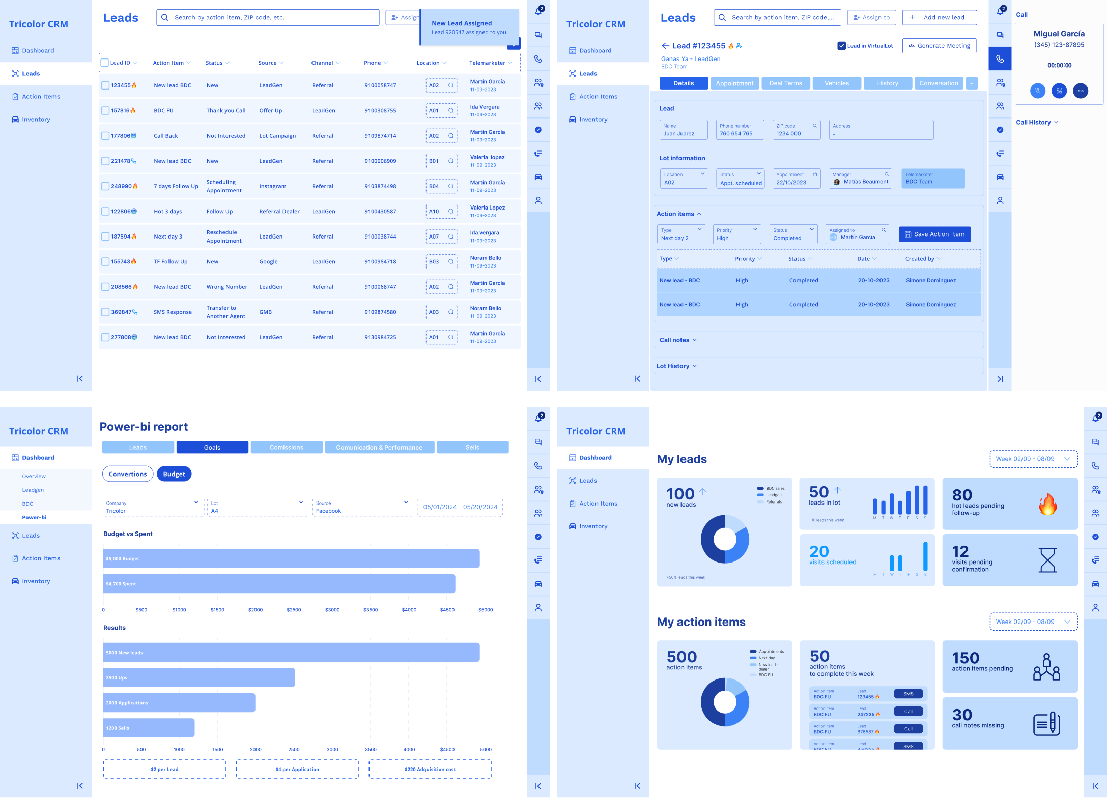
Redesign the platform into a cleaner, more modern, and intuitive experience that simplified workflows,
improved usability, reduced time spent searching for tools and information, and made the system easier to learn and use across teams.
RESEARCH
The first step of the research process was reviewing all existing platform documentation. However, much of the documentation was incomplete and difficult
to understand for someone unfamiliar with the system, as many internal workflows, tools, and functions were either unclear or undocumented.
To better understand the platform and user needs, I began holding calls with team leads from each department that used the system. Since these leads had
already accumulated feedback from their teams, they provided valuable insights into the biggest pain points, workflows, and operational needs. I also worked
closely with the development team, especially the lead developer responsible for the original system, who provided detailed knowledge about internal
workflows, technical limitations, and critical backend processes that needed to be considered during the redesign.
Due to the platform’s complexity and the large amount of information involved, the research phase was divided into stages, starting with the two teams involved
in the earliest steps of the sales process before expanding into the remaining departments.
USER PERSONA
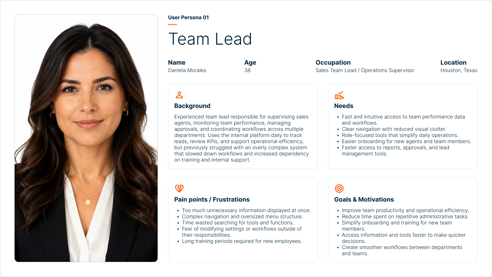
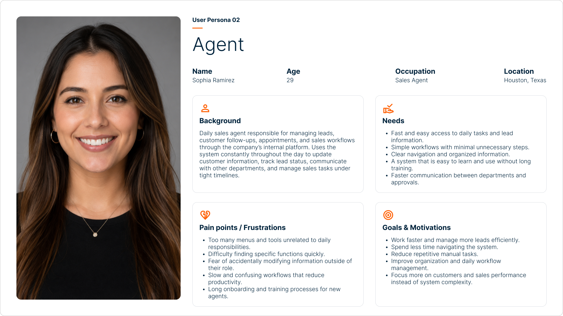
Two user personas were created for each department: one for team leads and another for the rest of the staff. Since leads required access to a broader range of
information, tools, and reporting features, their workflows and priorities differed significantly from regular users.
This approach helped define clearer role-based experiences and allowed the redesign to better adapt to the needs, permissions, and daily tasks of each type of
user across the platform.
FLOW TO RESOLUTION
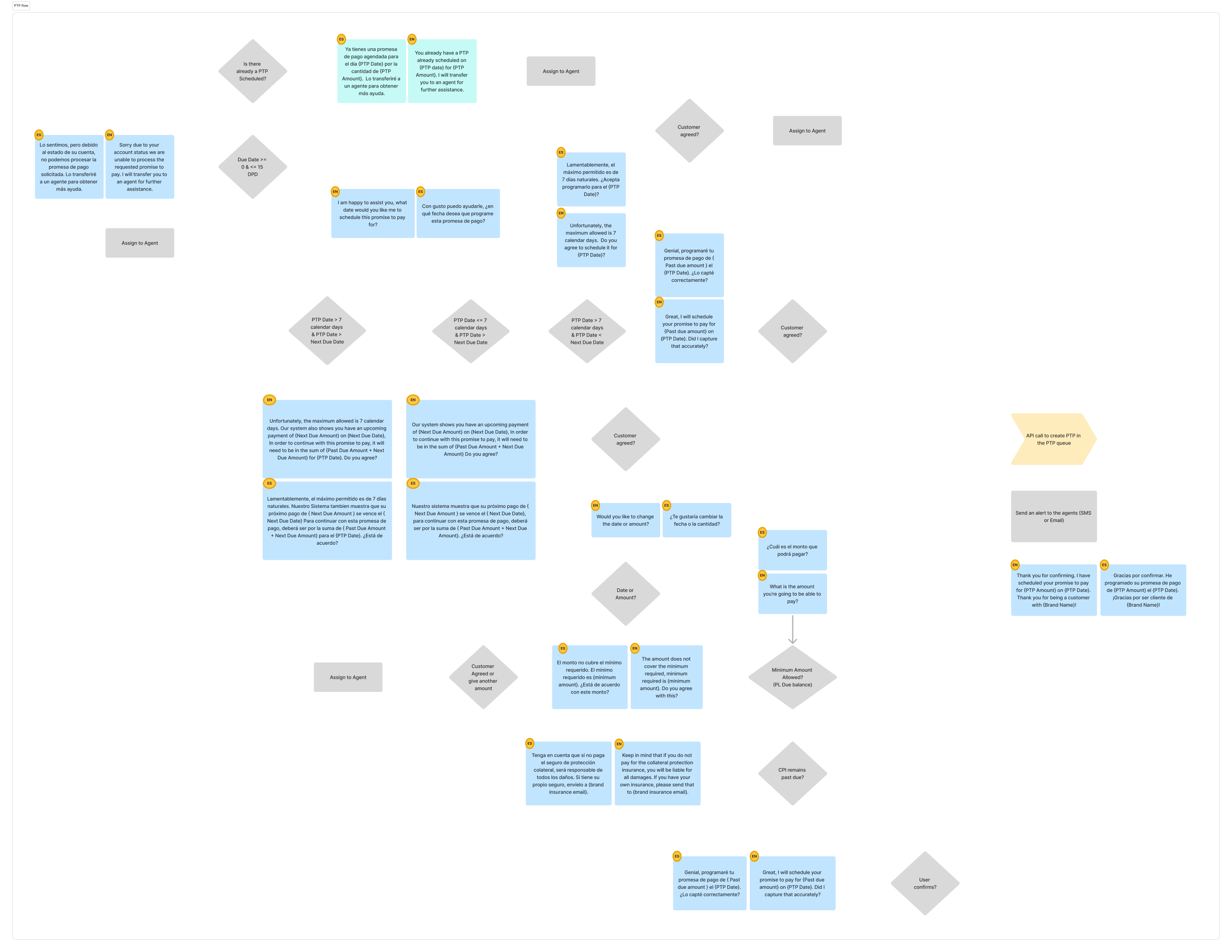
I worked closely with the lead programmer responsible for the original platform through multiple collaborative sessions to fully understand the existing
system architecture, workflows, dependencies, and internal limitations. Together, we mapped complete user journeys and workflow structures for each major
system feature, creating a detailed reference of how the platform operated across departments.
After consolidating feedback from all teams, identifying pain points, and understanding what users actually needed from the new platform, I redesigned the
workflows for each department individually. A permission-based system was introduced so users would only see the tools, information, and actions relevant
to their specific roles and responsibilities, based on the defined user personas. This significantly reduced unnecessary complexity, simplified navigation,
shortened user journeys, minimized training requirements, and created a much faster and more intuitive experience across the platform.
WIREFRAMING
Before moving into the visual redesign phase, the main priority was defining a target user experience that felt simple, intuitive, fast, and free from
unnecessary information overload. Multiple rapid wireframe explorations were created and reviewed directly with users across different departments to gather
feedback and validate workflow decisions early in the process.
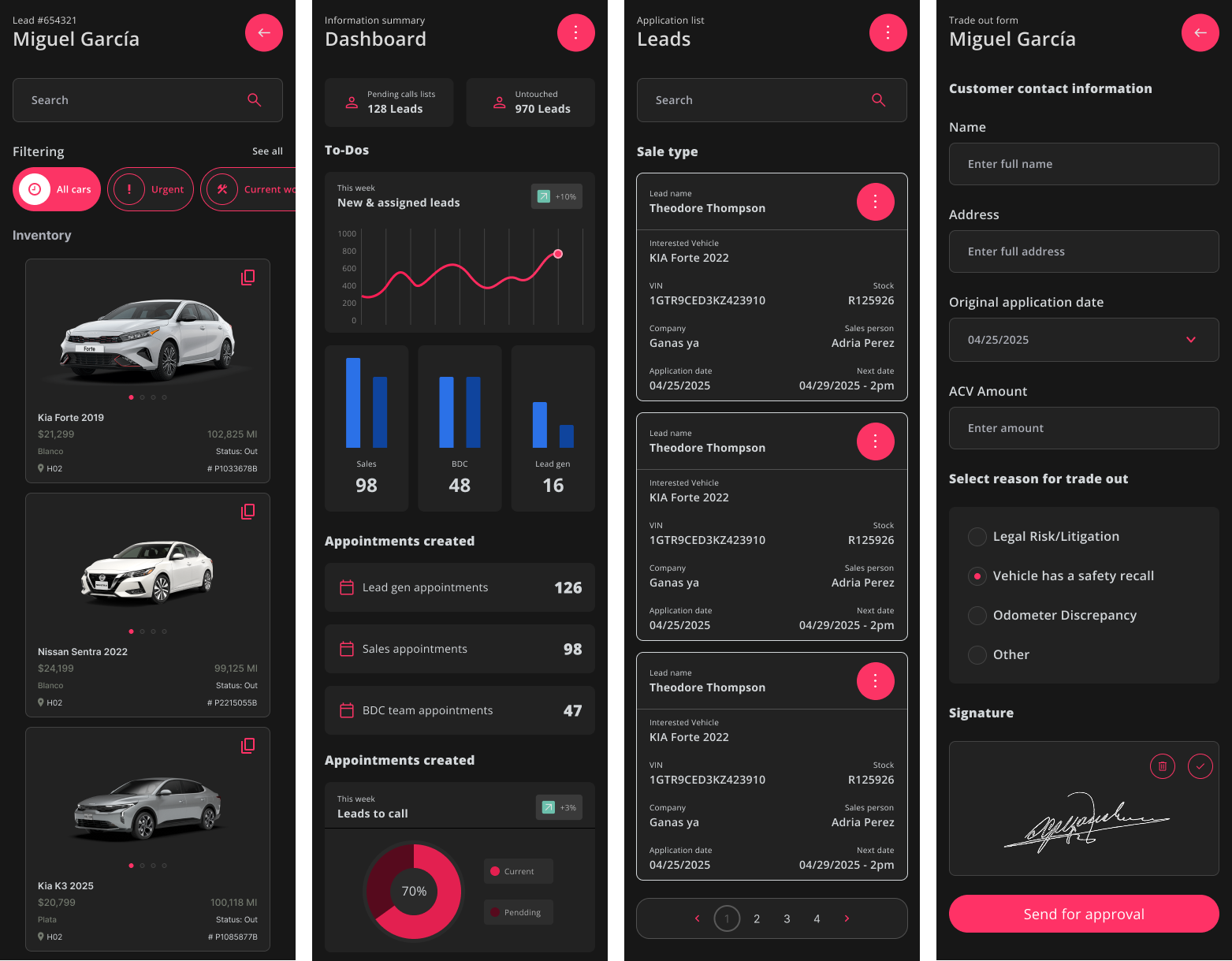
Once the structure and user flows were tested and approved, the project moved into the visual design phase. The wireframes were intentionally developed at a
medium-fidelity level to provide a clearer representation of the future platform experience. This helped agents, leads, and other stakeholders better
understand the UX direction and reduced the friction that often comes from interpreting low-fidelity wireframes.
FINAL DESIGN
The final design was achieved through multiple iterations, continuous user testing, and direct feedback from the platform’s end users across different
departments. Each phase of the redesign was refined collaboratively to ensure the new experience aligned with real operational needs and daily workflows.
Because the process involved working closely alongside the final users throughout development, it also functioned as an early onboarding and training
process for the new platform. By the time the redesign was approved, users were already familiar with the new structure, workflows, and overall experience,
helping reduce adoption friction and making the transition significantly smoother.
IMPACT
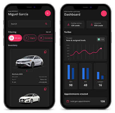
The redesigned platform became significantly more intuitive, easier to navigate, and free from unnecessary visual clutter that previously distracted users
from their actual responsibilities. By introducing role-based experiences and simplified workflows, users spent far less time on training, searching for
tools, or worrying about interacting with features outside of their responsibilities.
The redesign also introduced new tools and workflow improvements requested directly by users during research and feedback sessions, making their daily tasks
faster and more efficient. As a result, teams experienced a major increase in productivity, operational efficiency, and overall performance, ultimately
doubling workflow output and effectiveness across multiple departments.
LEARNING
One of the biggest lessons from this project was understanding the importance of designing around the real needs of end users. While the platform itself was
highly robust and feature-heavy, users ultimately needed a much simpler, faster, and more intuitive experience focused on their day-to-day responsibilities.
Working closely with users throughout the process revealed that many of the most important usability insights could only come from the people interacting
with the system every day. Their workflows, frustrations, and operational needs shaped the final direction of the product far more effectively than
assumptions or technical complexity alone.